I’ve had a few days off lately and I decided to try something a bit different. Instead of writing an(other) lengthy article, I thought I would go back to my roots and actually look at some data. To that end I recently discovered a website for open data in Australia, data.gov.au. This website has literally thousands of interesting datasets released from all levels of government, covering everything from the tax bills of Australia’s largest companies to the locations of trees in Ballarat.
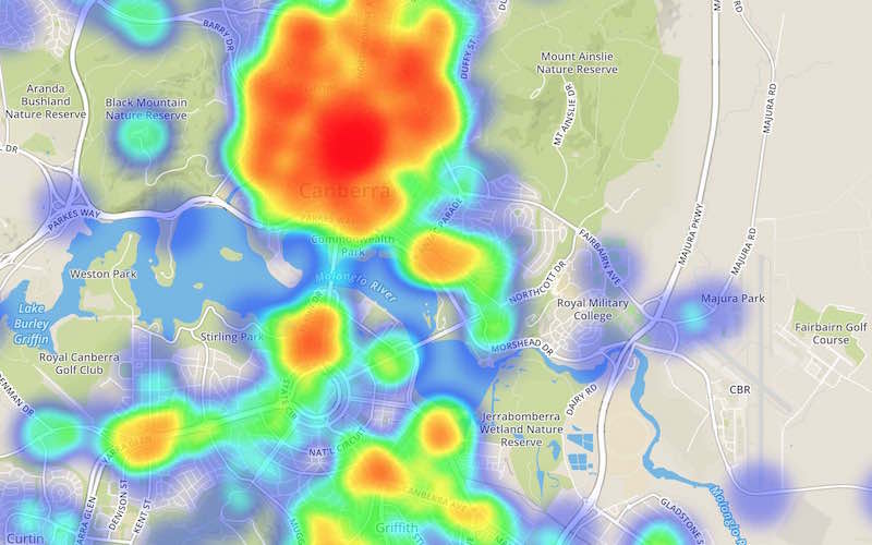
One of the first datasets that caught my eye was one published by the Australian Capital Territory (ACT) Government on traffic accidents involving cyclists. For those that don’t know, Canberra (the main city in the ACT) is a very bike friendly city and is home to a large number of recreational and more serious cyclists, so seeing where the accidents were/are occurring was something I thought would be interesting.
Using a few new things I have not used before (primarily Mapbox and leaflet.js), I put (slapped?) together an interactive map that uses the data provided and also gives you a few different ways of viewing it. The full version of the map can be accessed by clicking the picture below:

See a bug? Found it particularly useful? Hate it? Leave a comment below!
Leave a Reply