Data Inspired Insights

Category: United States

The argument for taxing capital gains at the full rate

Politicians, both in Australia and the US, when asked how they will find the money to fund various policy proposals, often resort to the magic pudding of funding sources that is “closing the loop holes in the tax code”. After all, who can argue with stopping tax dodgers rorting the system? But as Megan McArdle recently pointed out, raising any significant revenue from closing loop holes requires denying deductions for things that a lot of middle and lower class people also benefit from. This includes, among other things, deductions for mortgage interest, employee sponsored health insurance, lower (or no) tax on money set aside for pensions and no tax on capital gains when the family house is sold.[1]

Broadly, I agree with McArdle’s point. The public, in general, are far too easily convinced by simplistic arguments about changes to taxation – as if after decades of tax policy changes there are still simple ways to increase revenues without anyone suffering. Any changes made at this point are going to cause winners and losers, and often, the people intended to be the losers (usually the rich) are less affected than some other group that also happened to be taking advantage of a particular deduction.

That said, there is one point, addressed breifly in McArdle’s article, that I thought deserved greater attention – the concessional taxation of capital gains. In the list provided in the article, it was the second most expensive tax deduction in the US at $85 billion a year[2]. You see, for a while now I have been somewhat of a closet skeptic of the need for lower tax rates on capital income (i.e. capital gains and dividends). The reason for my skepticism is two fold:

  1. Everyone seems to be in agreement that concessional rates for capital income are absolutely necessary, but no one seems to really understand why.
  2. Capital income makes up a much larger percentage of income for the wealthy than for the lower or middle class. When you hear that story about billionaire Warren Buffet paying a lower rate of tax than his secretary, it is because of the low rate of tax on capital income.

So, now that I am finally voicing my skepticism, this article is going to look at what arguments are made for lower tax rates on capital income (focusing on capital gains for individuals) and whether those arguments hold water.

Why are capital gains taxed at a lower rate?

Once you start digging, you quickly find there is a range of arguments (of variable quality) being made for why capital gains should be taxed at a lower rate. These arguments can largely be grouped into the following broad categories:

  1. Inflation
  2. Lock-In
  3. Double Taxation
  4. Capital is Mobile
  5. The Consumption – Savings tradeoff

Inflation

Taxing capital gains implies taxing the asset holder for any increases in the price of that asset. In an economy where inflation exists (i.e. every economy) this means you are taxing increases in the price of the asset due to inflation, as well as any increase in the value of the asset itself. Essentially, even if you had an asset which had only increased in value at the exact same rate as inflation (i.e. the asset was tradable for the same amount of goods as when you bought it), you would still have to pay capital gains tax.

The inflation argument although legitimate, is relatively easy to legislate around by allowing asset holders to adjust up the cost base of their assets by the inflation rate each year.

Lock In

‘Lock-in’ is the idea that investors, to avoid paying capital gains tax, will stop selling their assets. An investor holding onto assets to avoid tax implies they are being incentivized, through the tax system, to invest suboptimally – something economists really dislike. However, as far as ‘lock-in’ would occur, it cannot be considered anything other than an irrational reaction. Holding onto assets does not avoid tax, it only delays it, and given inflation is factored into the asset price (as discussed above), there is not even the benefit of time reducing the tax burden. The bottom line is this – to pay more capital gains tax, there must be larger capital gains. That is, even if the capital gains tax rate was 99%, an investor would still be better off making larger capital gains than smaller ones.

The other point to remember when it comes to ‘lock-in’ is that in both the US and Australia, the lower rate of capital gains tax only applies to assets held for more than a year. That means if ‘lock-in’ exists, it is already a major problem. Because asset holders can access a lower rate of tax by holding an asset for a year, they are already strongly incentivized to hold onto their underperforming assets longer than is optimal to access the concessional tax rate. In fact, increasing the long-term capital gains tax rate to the same level as the short-term rate should actually reduce lock-in by removing this incentive.

Double Taxation

The double taxation argument is a genuine concern for economists. The double tax situation arises because companies already pay tax on their profits. Taxing those profits in the hands of investors again, either as capital gains (on that company’s stock) or dividends, implies some high marginal tax rates on investment. This is one of the main reasons capital income is taxed at low rates in most countries.

Ideally, to avoid this situation, the tax code would be simplified by removing company tax altogether, as McArdle herself has argued in the past. However, we should probably both accept that, at best, the removal of corporate tax is a long way away. Nevertheless, this idea can form the basis for policies that achieve similar goals without the political issue of trying to sell the removal of corporate tax.

For dividends, for example, double taxation can be avoided by providing companies with a deduction for the value of dividends paid out to investors. Investors would then pay their full marginal tax rate on the dividends, more than replacing the lost company tax revenues.

Preventing double taxation of capital gains is a little more complicated, but the answer may lie in setting up a quarantined investment pool that companies can move profits into. Profits moved into this pool would not be subject to tax and, once in the pool, the money could only be used for certain legitimate investment activities. This would effectively remove taxation on profits going toward genuine reinvestment, as opposed to fattening bonus checks.

The overall point here is not that I have the perfect policy to avoid double taxation of company profits, but that there are other worthwhile avenues worth exploring that are not simply giving huge tax breaks to wealthy investors.

Capital is Mobile

This is one of the two arguments McArdle briefly mentions in her article. The ‘capital is mobile argument’ is the argument that if we tax wealthy investors too much, they will do a John Galt, take their money and go to another country that won’t be so “mean” to them.

When it comes to moving money offshore, obviously, not everyone is in a position to make the move. Pension funds and some investment vehicles cannot simply move country. Companies and some other investment vehicles do not receive a capital gains tax discount currently, meaning raising tax rates for capital gains for individuals would not impact them at all. Finally, even for investors that would be affected and do have the means, a hike in the capital gains rate does not automatically move all their investments below the required rate of return.

This argument also overlooks the vast array of complications in moving money offshore and the risks involved with that action. Moving assets offshore exposes investors to new risks such as exchange rate risk[3] and sovereign risk[4]. It also significantly complicates the administrative, compliance and legal burden the investor has to manage.

However, even if we concede that yes, some money would move offshore as a result of higher taxes on capital gains, let’s look at the long term picture. What is the logical end point for a world where each country employs a policy of attracting wealthy investors by lowering taxes on capital? A world where no country taxes capital!

Of course, there are alternatives. Countries (and developed countries in particular should take the lead on this) can stop chasing the money through tax policy and focus on other ways of competing for investment capital. Education, productivity, infrastructure, network effects, low administrative and compliance costs are all important factors in the assessment of how attractive a location is for investors. California, for example, is not the home of Silicon Valley because it has low taxes on capital. Pulling the ‘lower taxes to attract investment’ lever is essentially the lazy option.

Consumption vs. Savings

The second point raised by McArdle is the argument that if you reduce the returns from investing (by raising tax rates), people will substitute away from saving and investing (future consumption) and instead spend the money now (immediate consumption).

The way to think of this is not of someone cashing in all their assets and going on a spending spree because the capital gains tax rate increased. That is extremely unlikely to happen and would actually make no sense. The change will come on the margin – because the returns on investment have decreased slightly (for certain asset types), there will be slightly less incentive to save and invest. As a result, over time, less money ends up being invested and is instead consumed.

But let’s consider who would be affected. If we think about the vast majority of people, their only exposure to capital gains is through their pension fund and the property they live in, neither of which would be affected by increasing the individual capital gains tax rate. Day traders, high frequency traders and anyone holding stocks for less than a year on average would also be unaffected. Most investors in start-ups do so through investment vehicles that are, again, not subject to individual capital gains tax[5]. That leaves two main groups of investors impacted by an increase in the capital gains tax rate for individuals:

  1. Property investors
  2. High net worth individual investors

Given property investing is not what most people are thinking about when concerns about capital gains tax rates reducing investment are raised, let’s focus on high wealth investors.

The key issue when considering how these investors would be affected by an increase in the capital gains tax rate is identifying what drives them to invest in the first place. Many of them literally have more money than they could ever spend, which means their investment decisions cannot be driven by a desire for future consumption. Many of their kids will never want for anything either, so even ensuring the financial security of their kids is not an issue. The only real motivation that can be left is simply status, power and prestige. Or as the tech industry has helpfully rebadged it – ‘making the world a better place.’

If that is the motivation though, does a rise in the capital gains tax rate change that motivation?

To my mind, the answer to that question is ‘No’. These people are already consuming everything they want, or in economic parlance, their desire for goods and services has been satiated. They will gain no additional pleasure (‘utility’) from diverting savings to consumption, so there is no incentive to do so even when the gains from investing are reduced.

Of course, there are exceptions, and it is quite possible (even likely) that there are high net worth individuals who live somewhat frugally and as a result of this policy change would really start splashing out. The question is how significant is this amount of lost investment, and does the loss of that investment capital outweigh the cost to society more widely of a deduction that flows almost entirely to the wealthy.

The Research

Putting this piece together, I have studiously attempted to avoid confirmation bias.[6] Despite the fact that I would benefit personally from lower tax rates on capital gains (well, at least I would if my portfolio would increase in value for a change), I definitely want to believe that aligning capital gains tax rates with the tax rates on normal income would raise significant amounts of tax, mostly from wealthy individuals, with few negative consequences.

In my attempts to avoid confirmation bias, I have deliberately searched for articles and research papers that provide empirical evidence that lower capital gains tax rates were found to lead to higher rates of savings, investment and/or economic growth. I have not been able to find any. There were some papers that claimed to show that decreasing capital gains tax rates actually increased tax revenue, but reading the Australian section of this paper (about which I have some knowledge), it quickly became clear this conclusion had been reached using a combination of cherry picking dates[7] and leaving out important details.[8]

I did also find some papers that, through theoretical models, concluded higher taxes on capital income would cause a range of negative impacts. But the problem with papers that rely on theoretical models is that for every paper based on a theoretical model that concludes “… a capital income tax… reduces the number of entrepreneurs…” there is another paper based on a theoretical model that concludes “… higher capital income taxes lead to faster growth…

Leaving research aside, there were a number of articles supporting the lowering or removing of capital income taxes. The problem is they all recite the same old arguments (“it will cause lock-in!”) and tend to come from a very specific type of institution. Without going too much into what type of institution, let me just list where almost all the material I located was coming from (directly or indirectly):

Even when I found an article from a less partisan source (Forbes), it turned out to be written by a senior fellow at the Cato Institute, and was rebutted by another article in the same publication.

Of course we should not ignore what people say because they work for a certain type of institution – just because they have an agenda does not mean they are wrong. In fact, it stands to reason that organizations interested in reducing taxation and limiting government would research this particular topic. The problem is that if there are genuine arguments being made, they are being lost amongst the misleading and the nonsensical.

Take this argument for lower taxes on capital as an example. First there is a chart taken from this textbook:

Capital per Worker vs. Income per Worker

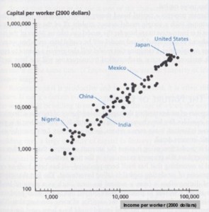
The article then uses this as evidence to suggest more capital equals more income for workers. As straightforward as this seems, what this conclusion misleadingly skips over is:

  • income per worker is not equivalent to income for workers, and
  • almost all the countries towards the top right hand corner of this chart (i.e. the rich ones) got to their highly capital intensive states despite having high taxes on capital.

A Change in Attitude?

The timing of this article seems to have conveniently coincided with the announcement by Hilary Clinton of a new policy proposal – a ‘Fair Share Surcharge’. In short, the surcharge would be a 4% tax on all income above $5 million, regardless of the source. Matt Yglesias has done a good job of outlining the details in this article if you are interested.

The interesting aspect of this policy is, given the lower rate of tax typically applied to dividends and capital gains, it is a larger percentage increase in taxes on capital income than wage income. Of course, unless something major changes, this policy is very unlikely to make it past Congress and so may simply be academic, but at least it shows one side of politics may be starting to question the idea that taxes on capital should always be lower.

The Data

Finally, I want to finish up with a few charts. The charts below show how various economic indicators changed as various changes were made to the rate of capital gains tax, historically and across countries. Please note, these charts should not be taken as conclusive evidence one way or the other. The curse of economics is the inability to know (except in rare circumstances) what would have happened if a tax rate had not been raised, or if an interest rate rise had been postponed. The same applies with changes to the capital gains tax rate. Without knowing what would have happened if the capital gains tax rate had not been changed, we cannot draw firm conclusions as to what the result of that change was.

However, what we can see is that the indicators shown below do not seem to be significantly affected by changes in the capital gains tax rate, one way or the other – the effects appear to be drowned out by larger changes in the economy. That could be considered a conclusion in itself.

Chart1 – Maximum Long Term CGT Rate vs. Personal Savings rate, US 1959 to 2014

Chart 2 – Maximum Long Term CGT Rate vs. Annual GDP Growth, US 1961 to 2014

Chart 3 – Maximum Long Term CGT Rate vs. Gross Savings, Multiple Countries, 2011-2015 Average

Gross savings are calculated as gross national income less total consumption, plus net transfers. This amount is then divided by GDP (the overall size of the economy to normalize the value across countries.

Chart 4 – Maximum Long Term CGT Rate vs. Gross Fixed Capital Formation, Multiple Countries, 2011-2015 Average

Gross fixed capital formation is money invested in assets such as land, machinery, buildings or infrastructure. For the full definition, please see here. This amount is then divided by GDP (the overall size of the economy to normalize the value across countries.

Chart 5 – Maximum Long Term CGT Rate vs. Gini Index, 2011-2015 Average

The Gini index is a measure of income inequality within a country. A Gini index of 100 represents a country in which one person receives all of the income (i.e. total inequality). An index of 0 represents total equality.


[1] Interestingly, two of these four deductions (mortgage interest and employee sponsored health insurance) will be completely foreign to Australians.

[2] A similar policy (50% tax discount for capital gains) in Australia costs around AUD$6-7 billion per year.

[3] The risk that the exchange rate changes and has an adverse impact on the value of your investments.

[4] The risk that the government of the country you are investing in will change the rules in such a way to hurt your investments.

[5] Capital Gains Tax Policy Toward Entrepreneurship, James M. Poterba, National Tax Journal, Vol. 42, No. 3, Revenue Enhancement and Other Word Games: When is it a Tax? (September, 1989), pp. 375-389

[6] Confirmation basis is the tendency of people, consciously or subconsciously, to disregard or discount evidence that disagrees with their preconceived notions while perceiving evidence that confirms those notions as more authoritative.

[7] “After Australian CGT rates for individuals were cut by 50% in 1999 revenue from individuals grew strongly and the CGT share of tax revenue nearly doubled over the subsequent nine years.” Note the carefully selected time period includes the huge run up in asset prices from 2000 to 2007 and avoids the 2008 financial crisis, which caused huge declines in CGT revenues.

[8] “Individuals enjoyed a larger discount under the 1999 reforms than superannuation funds (50% versus 33%), yet yielded a larger increase in CGT payable.” This neglects to mention that even after the discounts were applied, the rate for of capital gains tax for almost all individuals was still higher than for superannuation funds.

Should the Wealthy be able to pay for Better Healthcare?

Commenting on an article on reddit.com, I recently got into an argument[1] with someone about healthcare and more specifically the role of private healthcare. The article was this NY times piece that talks about how US hospitals provide a range of benefits for wealthier ‘clients’ (at significant additional cost of course). These benefits can be anything from nicer rooms to gourmet food and access to business centers.

My first reaction to the piece was, what I expect, the desired response – indignation. In a country like the US where there are countless healthcare horror stories (the story of a carpenter having to choose which fingers to reattach as covered in Sicko is particularly famous), this seems outrageous. How can some people not afford access to healthcare at all, and yet others are paying huge sums to stay in private rooms and eat soft cheeses?

I believe in my case, this sense of indignation was particularly strong because I come from one of the many non-US developed countries in the world with a basic but functioning universal healthcare system. No one avoids going to hospital for fear of being bankrupted by the cost. No one has to make horrible decisions about which appendages to reattach. The only major drawback in most universal healthcare systems is procedures that are non-life threatening can have significant wait times.

A good example of this is getting surgery to repair an ACL. You can get it done through the public health system (Medicare in Australia), free of charge – or close to free. However, because you are not going to die from a ruptured ACL, you are likely to have to wait for 1-2 years to get that surgery done through Medicare. If, on the other hand, you have something like $5,000-$10,000 you can have it done next week[2].

As you may have observed from this example though, this sounds very close to what I was getting all indignant about in the first place – wealthy people buying access to better healthcare. In fact, in most universal healthcare systems, including Australia’s, the wealthy do have the option to pay more to receive access to better care and/or skip to the front of the queue. In reality, the NY Times article could easily have been talking about Australian hospitals. What is more, the ability of richer patients to pay for better service is often viewed as necessary for the system in Australia – the extra money paid by wealthy patients helps to fund the system for others. So why does it feel different?

After several days of mentally dissecting this issue I think I have come to a conclusion as to why the NY Times story got such a reaction out of me and yet I had a generally positive impression of the private health system in Australia. The key difference (at least in my mind) is the extent of the privatization of the healthcare system. In the US, healthcare has been privatized to such an extent that some people have been priced out of the market completely. When this is contrasted with the opposite end of the spectrum – private rooms, nicer robes, lobster stuffed with tacos – it highlights that the problem with the system is not an overall lack of resources, but that those resources are being allocated in such a way that some people do not get access.

Contrast this to the existence of private health systems in countries with universal healthcare. Even though some patients are able to access better facilities (and potentially doctors), everyone has access to a (generally) good level of healthcare, regardless of wealth or insurance policy. Because of this, the fact that some people can pay extra for nicer rooms seems much less important. The system has enough resources for everyone – so it is not perceived as resources being taken from poorer patients.

However, it is worth asking the question of whether this is right or simply a convenient piece of logic.

To assess the morality of the wealthy having the ability to purchase better healthcare services, we have to recognize the two main constraints on a healthcare system. The first constraint is the supply of personnel, equipment and medical supplies. The second constraint is the supply of money. These constraints are not unrelated. An endless supply of money will not help if there is a shortage in equipment/personnel at a given point in time. But money can help to increase the supply of these things in the future.

If we accept the premise that wealthy patients benefit healthcare systems by adding additional money into the system, going back to the constraints above, we can see that essentially this is a short term sacrifice for a longer term gain. Assuming that the demand for healthcare will always exceed supply, wealthy patients skipping to the front of the queue will take resources away from poorer patients in the present. They occupy beds, take time away from doctors and require access to equipment just like any other patient. However, they also pay money into the system that allows future patients to access treatment they might not otherwise have had access to.

Here is where it gets a bit murkier. If we are saying that payments from wealthy patients are needed for the system to function in the future, are we not then implying that the system is underfunded? Why can that money not come from other sources such as higher tax rates or lower spending in other areas of the budget? The problem with that line of thinking is that in any realistic government budget, there will always be room for additional healthcare funding. No government is ever likely to fund a healthcare system to the point that everyone gets the best possible treatment instantaneously[3]. So even in a much better funded public health system than currently exists in most countries, additional funds provided by wealthy patients will still allow for better treatment of other patients in the future.

All this does not mean we have to like the US model of healthcare where money plays far too big a role for the comfort of many. Denying patient access to healthcare (or bankrupting them for emergency care) in a modern developed country is a deplorable situation. But my overall conclusion is that it is best to focus your indignation on the real issues with the system – the excessive insurance premiums, the tying of affordable insurance to employment, the huge markups charged by many hospitals and the unnecessary expensive treatments added to patients bills.

As outrageous as it seems to picture wealthy patients receiving lavish treatment in private rooms while others are avoiding necessary treatment for fear of the cost, it is not the real issue. In fact it is probably providing a net benefit in a deeply flawed system.


[1] Those that know me will find this very unsurprising

[2] This cost, it should be noted, is still a fraction of the $55,000+ my health insurance company paid for that procedure in the US.

[3] If that was the case, you would also have idle resources for much of the year

Hours Worked Are Going Up – Here is the Evidence

A couple of weeks back, I posted a blog that seemed to tap a nerve. The blog addressed what many white-collar workers, particularly in the private sector, have been feeling for some time: pressure to put in longer hours at the office. This week, I wanted to look into the statistics to see if there is evidence to support the anecdotal stories of increasingly common 60-hour weeks.

To address this question, we are going to look at data from a range of sources, including Australia, the US, and the OECD.

The Picture in the US

Starting in the US, the Bureau of Labor Statistics (BLS) produces data on average weekly hours. This data has a lot of fine level detail on average weekly hours by sector and subsector, but unfortunately, only goes back to March 2006. Still, if there is a trend towards longer hours in recent times, it should be apparent.

Chart 1 – Average Weekly Hours by Industry

Chart 1 above shows the average weekly hours for the three main sectors for white-collar workers, Financial Services, Information, and Professional and Business Services. The first thing that stands out is there does appear to be an upwards trend in the average weekly hours for Financial Services workers and for Profession and Business Services workers. Both sectors look like they have added an extra hour on average over the past 9 years. Given the short time frame and the number of people involved in those sectors, that should be considered substantial. Multiplying extra hour by the number of employees in those sectors, (approximately 8 million and 19 million respectively), works out to an additional 3,375,000 working days (assuming 8 hours a day) every week – between those two sectors alone.

Drilling down into the detail, Chart 2 shows the Professional and Business Services sector broken down into its various subsectors.

Chart 2 – Average Weekly Hours – Professional and Business Services

At this level of detail, the data shows us that the increase in the sector as a whole is far from uniform:

  • Accounting, Tax Preparation, Bookkeeping and Payroll Services, Advertising and Related Services, and Other Professional Scientific and Technical Services have added around 2 hours per week
  • Legal Services and Management, Scientific and Technical Consulting Services have added approximately 1 hour a week
  • The remaining subsectors have remained flat, or even declined slightly.

Interestingly, data for the most infamous subsectors for long hours, Legal (Legal Services) and consulting (Management, Scientific and Technical Consulting Services) show employees averaging between 36 and 37 hours a week, which would seem to be very normal. This is probably indicative of two things:

  1. People in legal and consulting generally aren’t working as many hours as we assume (or they tell us).
  2. The people working long hours in these subsectors are limited to a few top tier firms. Their long hours are being drowned out by large numbers of people working normal hours.

There is also another thing to keep in mind when looking at this data. These statistics are based on surveys that are voluntary for people to respond to. As a result, there is likely to be some bias in the data towards lower hours due to people who do work long hours opting out of the survey altogether. This bias would impact all sectors and subsectors, but could be masking more dramatic increases in the averages.

What about Technology?

In Chart 1, the average weekly hours for the information sector (of which technology based industries are subsectors) barely moved over the last 9 years. However, as seen previously, looking at the information sector in aggregate can be deceiving. Chart 3 shows the information sector broken down into its various subsectors.

Chart 3 – Average Weekly Hours – Information Sector

Looking at this breakdown, the expected increase in average hours worked becomes more apparent. The Data Processing, Hosting and Related Services subsector has added close to 3 hours a week since 2006, while the Other Information Services subsector has added around 2 hours a week.

An interesting point to note is that for the Other Information Services subsector, the average weekly hours have been decreasing for the past 12-18 months. Looking at the period 2006-2013, it looked like this sector was on course to add 4 hours a week. However, after peaking at 36.4 hours a week in December 2013, the subsector has steadily lost hours to the point that for the first 6 months of 2015, the average was just 34.6 hours per a week. Whether this is the result of more work friendly policies, more competition for staff or some other factor remains to be seen.

Hard Working Aussies?

Moving on to Australian data from the Australian Bureau of Statistics (ABS), the dataset available is longer than what was available from the BLS, but it is lacking fine level detail. The ABS data goes back to 1978 and is split by different brackets of hours worked. For example, 1-15 hours, 16-29 hours, 60+ hours and so on. Chart 4 below shows the percentage of employed people in each bracket[1] (based on a 12-month moving average).

Chart 4 – Australian Employees by Average Weekly Hours

The most striking aspect of the chart is the decline in the number of people working between 30 and 40 hours a week – or what most people would consider a regular full time job. As late as January 1986, more than half of Australian workers were working between 30 and 40 hours a week. By the turn of the century, that percentage was closing in on 40%. From the data, most of the people who moved out of the 30-40 hours a week category appear to have moved into the ‘less than 30 hours a week’ category. This substitution of full time jobs for part time and/or casual employees is sometimes referred to as ‘casualization’.

In Australia, the ‘casualization’ of the workforce has been a much-discussed topic. Some argue that it is the natural result of more modern, flexible working arrangements. Others see negatives in reduced job security and reduced benefits (casual employees do not get access to paid leave for example). One thing that is for certain is the number of people affected continues to increase.

Moving on to the other end of the spectrum, those working 50+ hours a week, there are two distinct phases. The first phase, from 1979 through to the year 2000 shows a strong increase in the number of people working 50+ or more hours. The second phase, from 2000 onwards shows a decrease in the number of people in this category that almost completely unwinds the previous increase. Another interesting observation is that the decrease in people working 50+ hours from 2000 onwards is almost exactly mirrored by the gain in people working 30-40 hours a week over that period.

It is difficult to say what exactly is driving this change. Are employees leaving jobs that require longer hours for jobs with better work life balance? Are companies becoming more serious about looking after their employees? Has the recent mining boom, which has led to huge economic changes, caused a shift away from industries that have longer hours? All these questions are a topic for another blog post.

What can be said is that, at a high level, there is little to indicate that longer hours are becoming the norm for Australian workers. But, like the US example, without looking at the data at a sector and subsector level, this data tells us very little about what is happening in legal offices and tech startups in inner city Sydney and Melbourne.

The International Perspective

The OECD also provides statistics on average yearly hours across a range of countries. Looking at yearly hours worked is slightly different to weekly hours because of differing leave allowances and expectations between countries, but it does allow us to look at how things have changed over time within each country. Chart 5 shows the average yearly hours for a selection of countries.

Chart 5 – Average Annual Hours Worked – Selected Countries

Again, this data is at the highest level (all sectors, all employees), making it difficult to detect a small increase in average hours worked that is limited to some subsectors. However, this chart does provide some perspective on how much average hours worked a year has declined in pretty much all developed nations over the past 60 years. The decline in hours worked in France in particular is striking – falling from over 2,300 hours a year (almost 48 hours a week if 4 weeks of leave is assumed) to under 1,500 hours a week (just over 31 hours a week).

The other interesting point to note is the increase in hours in Sweden since the early 80s. Not having any knowledge of Swedish history outside of the recent Thor movies (which I assume are completely factually accurate), any explanation anyone could offer about what is happening here would be very welcome.

The Long Term Perspective

The final data source for comparison is a paper[2] released in 2007 by Michael Huberman and Chris Minns. The paper takes a look at the question of how hours worked have changed over time from a very long-term perspective. Chart 6 shows a summary of the main results from the paper.

Chart 6 – Huberman and Minns; Hours of work per week; 1870–2000

Similar to the OECD data, this data provides perspective on how far the average hours worked has fallen over time. The biggest gains were made in the interwar period as Henry Ford and other business owners realized lowering the hours of their employees actually ended up boosting output, and many countries adopted statutory hours.

We also see how cultural and policy differences in France has led to continued declines in hours worked post World War II, while the Anglo-Saxon nations have essentially had no real change.

Table 1 – Huberman and Minns; Hours of work per week; 1870–2000

  1900 1913 1929 1938 1950 1960 1970 1980 1990 2000
U.K. 56.0 56.0 47.0 48.6 45.7 44.7 42.0 40.0 42.4 40.5
France 65.9 62.0 48.0 39.0 44.8 45.9 44.8 40.7 39.9 35.8
Australia 48.1 44.7 45.5 45.0 39.6 39.6 39.6 39.2 40.1 40.6
U.S. 59.1 58.3 48.0 37.3 42.4 40.2 38.8 39.1 39.7 40.3

Another thing that is not so obvious from the chart, but is clearer in the underlying data (see Table 1), is that in Australia and the US, there has been an increase in hours worked from 1980 onwards. Although not significant when compared to hours worked by previous generations, this could be representative of more recent trends. One caveat on that is that this data series only runs to the year 2000, and, at least in the case of Australia, there were declines in the number of people working 50+ hours from 2000 onwards.

Wrapping Up

Overall, the evidence that people are working longer hours is mixed. When drilling down to specific subsectors in the BLS data from the US, the data indicates there has been an increase in average hours worked in most of the expected places. However, the gains appear small (1-3 hours a week) and no sector or subsector analyzed averaged over 40 hours a week.

The ABS data from Australia did show a significant increase in people working 50+ hours from the late 70s through to the turn of the century, but that trend then stopped and reversed. Meanwhile, the longer-term perspective provided by the OECD data and Huberman and Minns showed significant declines over the last 150 years, with little indication average hours worked were going back up in recent years.

Taking all this data into account, there are two main conclusions to be taken away:

  1. When looking at data aggregated across sectors, there is little indication that average hours worked are increasing. That doesn’t mean average hours worked are not increasing anywhere, but that it is not happening on a big enough scale to move the high level aggregate numbers.
  2. When drilling down into specific subsectors where anecdotal evidence suggests there should be increases, the data indicates that average hours worked have been increasing. Although the averages still seem low (i.e. less than 40 hours a week), when you take into account the spread of hours making up those averages, even a 1-2 hour average increase represents an increasingly large proportion of people in those subsector working very long hours.


[1] Note – I have aggregated some of the brackets to simply the picture.

[2] M. Huberman, C. Minns; The times they are not changin’: Days and hours of work in Old and New Worlds, 1870–2000; Explorations in Economic History 44 (2007) 538–567

US Labor Market Update – The Grind Continues

On June 5, the Federal Reserve released its latest Employment Situation Summary. The results were slightly better than expected – 280,000 jobs added in the month of May compared to an expected 226,000. There were also small upward revisions to the previously released numbers for March and April.

In terms of the long-term trends in the participation rate identified previously (see here), this update didn’t really change much. The participation rate has more or less stopped falling over the past 12 months, currently sitting at just under 63% (see Chart 1). The percentage of the civilian non-institutional population[1] that is employed continues to climb slowly back towards to 60%, but is still well below the peak of over 63% reached in 2007.

Chart 1 – Participation Rate vs. Employed as Percentage of Civilian Population

BLS_6_1

The benchmark unemployment rate for May was 5.5%, a slight increase from 5.4% in April and was matched by a slight increase in the number of people unemployed, up to 8.7 million. Even though this goes against the general downwards trend in unemployment since 2010, Chart 2 shows how this slight uptick doesn’t really impact on the broader trend.

Chart 2 – Unemployment Rate

BLS_6_2

Unemployed Breakdown

Looking at the breakdown of the unemployed (see Chart 3), the average period of unemployment continuing to normalize, with the number of people unemployed for 5-14 weeks now below the number unemployed for less than 5 weeks. The group of people unemployed for 15 weeks or more, although still large by historical standards, also continues to fall in both percentage and absolute terms. To provide some indication of just how far the size of this group has fallen, in mid-2010 there were over 9 million people who had been unemployed for 15 weeks or more. That number is now less than 4 million, a decrease of over 55%.

Chart 3 – Unemployed Persons by Length of Unemployment

BLS_6_3

The improving situation for the unemployed is also evident in the average weeks people spend unemployed (see Chart 4).

Chart 4 – Average Period of Unemployment

BLS_6_4

Industry Breakdown

In Part 4 of this series, we looked at what was happening to the number of people employed in various industries in the US economy. Chart 5 provides an update for some of the more interesting stories from that piece.

Chart 5 – Employment by Various Industries

BLS_6_5

By and large we see long standing trends continuing. Manufacturing continues to undergo a renaissance, bucking a long downwards trend. Nearly 1 million jobs have been added since the low point in early 2010. Education and health services, and professional and business services continue to grow strongly, while the government sector is basically still going nowhere.

Previously, we also looked in some detail at the Information sector, in particular the technology related subsectors. Chart 6 shows the breakdown of the information sector and its various subsectors.

Chart 6 – Employment in the Information Sector

BLS_6_6

What Chart 6 reveals is that the ‘Other information services’ subsector is clearly adding jobs at a fast pace, with data processing, hosting and related services also increasing employment. Chart 7 shows the employment growth rate in these two subsectors combined since 2006.

Chart 7 – Tech Subsectors Employment Growth

BLS_6_7

Since 2011, these sectors have been adding jobs at an annualized rate of between 6% and 8%. In total this has led to a 35% increase in jobs in these sectors since the start of 2011 – which is fantastic growth. But these subsectors are starting from a very low base –a 35% increase only translates into an additional 139,000 jobs. By way of comparison, over that same period, professional and business services added over 2.6 million jobs, education and health services added 1.9 million and even manufacturing added 700,000 jobs.

One thing to keep in mind though is that the tech boom is causing jobs to be created in other fields that service the technology sector. Lawyers, accountants, talent recruiters and HR personnel, among others, all provide support to the technology sector. Most of these roles are likely to sit in the professional and business services, which we just saw has added a lot of jobs. A big part of that story could be the tech boom.


[1] Persons 16 years of age and older residing in the 50 states and the District of Columbia, who are not inmates of institutions (e.g., penal and mental facilities, homes for the aged), and who are not on active duty in the Armed Forces.

Labor Statistics Part IV – The Employed

Previously in Parts II and III, we focused on two subsets of the population that are not employed – non-participants and the unemployed. In Part IV, we finally move on to looking at the population of employed people. However, in a slight change of tack, instead of focusing on the characteristics of these people, we are going to look at the changes in the employment market in general and more specifically at the changes at the industry level.

Declining Industries

Chart 1 – Industries with Declining Shares of the Employment Market 1939 to 2015

chart_4_1

Decline in Manufacturing

Looking at the data, the big story since the end of World War II (1945 for those who skipped History class) is the decline of the manufacturing industry. Manufacturing was far and away the biggest sector in the US in terms of employment at the end of the war, but has seen its share of the employment market decline to less than 9% as of 2015. The reasons for this have been the subject of a lot of discussion (see here for example), but if we look at the number of manufacturing jobs (see Chart 2), as opposed to the percentage of the non-farm employment market, we see there are two phases to this decline.

Chart 2 – US Manufacturing Jobs 1939 to 2015

chart_4_2

As Chart 2 makes clearer, manufacturing in the US was actually still adding jobs from 1945 through to the late 70s, it was just that the other sectors were adding more jobs, causing the manufacturing sector’s share of the employment market to decline.

From the mid 80s onwards though, the manufacturing sector started declining in both percentage and absolute terms. Increasing automation and the shift of jobs to low cost manufacturing countries such as China, India and other developing nations started what would be a long decline for the industry. There is one ray of light though, and that is that the US has actually been adding manufacturing jobs for the past 6 years. Although this looks like a positive change, it is hard to say whether this is the start of a new trend or just an aberration representing the recovery of jobs lost in the last downturn. The 90s boom saw similar gains before they were reversed very quickly in the new century.

Where is the Tech Boom?

The sector that you may be surprised to see in the declining chart is the Information sector. Information Technology (“tech”) seems to be the only sector that anyone is talking about right now – glitzy product launches, podcasts (the excellent Startup) and TV shows (Silicon Valley is fantastic if you haven’t seen it). So why don’t we see it in the employment data? To explain that, it helps to break the sector down into its component industries (see Chart 3).

Chart 3 – Information Sub Industries, All Employees 1990 to 2015

chart_4_3

The finer level data only goes back to 1990, but this is the key period we are interested in anyway. What we see is that despite the hype, the two tech related sub industries (Data processing, hosting and related services, and Other information services) are still very small, even within the Information sector. In terms of the number of people employed, these two sectors are drowned out by the traditional publishing industry and the telecommunications sector. So even though the two tech sub industries have been adding jobs, it has simply not been enough to outweigh the job losses in the larger sub industries.

The Telecommunication Boom

The other interesting point on Chart 3 is how much the tech boom in the late 90s impacted on the telecommunications sector. Despite the popular perception that this boom was a tech boom (it is called the dot com bubble after all), the boom led to far greater increases in job numbers (and job losses after the bust) in the telecommunications sector than in the tech sectors. The boom in telecommunications was primarily driven by telecom companies rushing to upgrade networks and infrastructure in response to exploding demand for the two hot new products of the time: the internet and mobile phones. After the bubble popped, some large companies went bust, others consolidated, but the net result was a lot of job losses.

Expanding Industries

Chart 4 – Industries with Expanding Shares of the Employment Market 1939 to 2015

chart_4_4

Moving on from declining industries, let’s look at the industries that have grown their share of the employment market over the past half a century. The clear winners here are the Education and Health sector, and the Professional and Business Services sector.

Professional and Business Services

Professional and Business Services cover a range of services that have gone from non-existent, or the domain of niche firms, to being the domain of some of the world’s largest firms. Additionally, being employed to provide services within this sector has become very prestigious (legal services and management consulting are good examples), allowing these firms to attract some of the top talent in the market place.

Overall, the growth in the number of people employed to provide these services is largely explained by the increasing complexity of doing business. Increasing complexity creates demand in several ways, including the need for:

  • People who are experts in one or a small subset of specific business functions
  • People who are experienced in navigating an increasingly complex regulatory environment, and/or
  • Agility to quickly respond to certain business needs that preclude hiring and training staff internally

In recent times there has been talk about larger businesses attempting to ‘in-house’ some of the services that professional services firms typically provide, particularly legal services and various compliance functions. As of yet, this does not appear to be impacting the employment growth of professional services firms.

Inexorable Rise of Education and Health

The Education and Health sector has shown the strongest and most consistent growth of any industry over the last 50 years. But what explains this strong growth? Chart 5 provides a breakdown of the subsectors within this industry.

Chart 5 – Education and Health Sub Industries, All Employees 1990 to 2015

chart_4_5

The first thing to note is that all the sub sectors have been adding a large number of jobs over the past 25 years, but there are two standouts:

  • Social Assistance (child care workers, personal and home care aides, social and human service assistants) has gone from easily the smallest sub-sector in 1990 to employing as many people as the Education sub-sector, tripling the number of people employed.
  • Ambulatory Health Care Services (outpatient medical services like dentists, GPs, diagnostic centers and so on) has become easily the largest sub-sector over the past 25 years, adding over 4 million jobs.

Generally this provides further confirmation of what we saw in Part II of this series – that there are larger numbers of Americans retiring and as they do, the demand for certain services, particularly health care is also growing.

Childcare Catch 22

One additional point to make on this subject is regarding the growth in childcare services, a key component of the overall growth of the sector. As the model of the family has changed to one with two parents in full-time employment, there has been a corresponding growth in demand for childcare services. For a lot of families this has presented a question – is it worth paying for childcare (does the parent earning the least still earn more than the cost of childcare?).

This causes a catch 22 for the childcare industry in most countries – childcare typically struggles to attract enough suitable employees due to a combination of parents’ (understandably) high expectations and generally low pay. However, if businesses in the childcare industry were to offer higher pay to childcare workers to attract more candidates, they would need to raise the cost of the childcare to parents, leading to more parents simply dropping out of the workforce to stay home and raise their children instead. Because of a parent’s ability to provide their own childcare services, without Government intervention, it will be difficult for the wages of childcare workers to ever significantly exceed the average income for parents in the area they service.

The Financial Sector Reflects the Market

The last sector I want to spend some time on in this section is the financial sector. One of the noticeable things from Chart 4 is, as a percentage of the total non-farm employment market, the financial sector hasn’t grown since the late 80s. This would seem to contrast with the general notion of an ever-expanding financial sector that is taking over the US economy. Again, the fact that we are looking at the data in terms of the percentage of total non-farm employees can be deceptive. Chart 6 shows the total financial sector employees from 1990 to 2015.

Chart 6 – Financial Sector, All Employees 1990 to 2015

chart_4_6

Looking at this chart, we see the Financial sector did add a significant number of jobs between 1990 and 2015, but the number of jobs in the financial sector is still relatively small compared to the economy as a whole. Additionally, the number of jobs in the Finance sector appears to change in line with with the economy as a whole. Does that mean the Financial sector doesn’t need to be reigned in or that it isn’t sucking talent out of the US economy into relatively unproductive industry? That is a topic for a separate article, but the one thing that can be said is that in terms of the number of people being employed by the Financial sector, everything looks very much like business as usual.

Stable Industries

Chart 7 – Industries with Stable Shares of the Employment Market 1939 to 2015

chart_4_7

The Government Sector

Despite there being observations we could make about both the other two industries on this chart, I am going to focus on the most interesting story on this chart – the Government sector. The basic story in the chart is the build up in the percentage of non-farm employees in the Government sector from 1945 to the mid 70s, and then a slow decline through to 2015. Again looking at the percentages can be deceiving, so let’s look at the number of employees in the Government sector (Chart 8):

Chart 8 – Government Sector, All Employees 1955 to 2015

chart_4_8

The period from 1955 to 2009 saw a pretty consistent build up in the Government sector – close to 15 million jobs were added in this time. But since 2009, ignoring census hiring in 2010 (you can also see corresponding spikes in all years ending with ‘0’ for the same reason), the number of people employed by the Government had its biggest decline since the early 80s. To help determine what is happening, let’s look at the Government sector broken down into its three sub-sectors, Local, State and Federal (see Chart 9):

Chart 9 – Government Sub Sectors, All Employees 1955 to 2015

chart_4_9

At first this would seem to show a slightly confusing picture. This decline from early 2009 through to late 2014 represents almost 6 years right in the middle of Barrack Obama’s presidency, but for all the noise about political stalemate in Washington, the sequester and the Government shutdown, there appears to have been minimal impact on the number of Federal Government employees. At the same time, Local Governments have been slashing payrolls and State Governments have essentially been in a hiring freeze. The explanation for this is largely due to:

  1. The nature of Local and State Government revenue sources – the three main types of taxes that Local and State Governments collect are income tax, forms of sales tax, and property tax. All three sources took sharp downturns in the recession, with property tax continuing to decline even as income and sales tax collections were recovering.
  2. Balanced budget requirements – many State and Local Governments have balanced budget requirements, which meant in the face of sharply falling revenues, they were forced to slash expenditures. In many cases this meant cutting payrolls, which unfortunately only exacerbated the effects of the recession locally.

The combination of sharply falling revenues and the inability to use debt financing led to large job losses at the State and Local Government level. On the other hand, it is well known that Federal Government does not have a balanced budget requirement (much to the chagrin to some on Capitol Hill) and, in contrast to the State and Local Governments, significantly increased spending going into the recession (the American Recovery and Reinvestment Act of 2009). The merits and impact of Government financed stimulus may be debated, but the impact on employment within the Government sector is pretty obvious.

A Strange Observation

The other surprising observation from Chart 9 is that the Federal Government has employed more or less the same number of people since the late 1960s – all the growth in the Government sector has come from the Local and State Government sectors. The growth in Local Government makes sense, the population of the US has increased significantly in that period and providing Governance for that population requires more employees. We also see growth in State Government for the same reasons – but nothing at the Federal level.

Technology and other efficiency gains should allow fewer people to do the same amount of work over time, and the productivity gains between now the 1960s have been huge. Additionally, the impact of these efficiencies would be greatest at the Federal level where the scale of the work is typically bigger and there is less need to maintain a physical presence all over the country/state in the same way that Local or State Government has to. But the efficiencies wouldn’t apply everywhere:

  • To audit the same percentage of businesses over time, the IRS would need to continually hire additional auditors to keep up with the growing number of people and businesses
  • For Social Security to continue to service a growing population, the number of locations (and the staff to keep them running) would also need to expand significantly

Even allowing for a more efficient work force, it seems unlikely that the Federal Government has been able to maintain the same levels of service, regulatory effectiveness and Government advisory when the country has grown so much in population and complexity.

From here it would be easy to launch into a diatribe about an understaffed Federal Government leading to issues like the financial crisis, the failure to detect various huge frauds (Enron, Bernie Madoff), and the generally poor quality of Government services (the torturous immigration process comes to mind[1]). I could then also go on to talk about how using the points above to argue for further reductions in the Federal Government seems crazily wrong-headed. However, linking all these events to a shortage of Federal Government employees is far too simplistic. These events were caused by a range of factors and simply adding more Federal public servants would not have solved the problem on its own.

All that said, not increasing staffing levels for 50+ years does have an impact. The next time you are forced to suffer through some unnecessarily archaic (Federal) Government process, read about another fraud that the SEC and/or FinCEN failed to pick up, or lament that lobbyists are writing a significant amount of legislation that gets put before congress, keep in mind that collectively the Government agencies providing these functions are today operating with the same number of people as they were when Neil Armstrong took his first steps on the moon.


[1] Please don’t tell me that this is done intentionally to discourage applicants – there are plenty of ways to discourage applicants without wasting huge amounts of time and money.


Have any thoughts on what impact constant levels of Federal Government staffing since the 1960s might have had? Please leave them in the comments!

Labor Statistics Part III – The Unemployed

Following on from Part II where I looked at the population of people who had left the labor force completely, this week I turn my attention to the unemployed. The unemployed are defined as those who are currently not employed but have made “specific efforts to find employment some time during the previous 4 week-period ending with the reference week”. Chart 1 maps the unemployment rate since 1948.

Chart 1 – US Unemployment Rate 1948 to 2015chart_3_1

Courtesy of the Bureau of Labor Statistics, there are several ways we can divide up the population of unemployed people to better understand what is driving the changes over time.

Cause of Unemployment

The first breakdown (shown in Chart 2) is the unemployed population (as a percentage of the total civilian labor force) broken down according to the cause of unemployment:

  1. Lost a job
  2. Left a job
  3. Rejoining the labor force after some hiatus
  4. Joining the labor force for the first time

Chart 2 – Unemployed Persons by Cause 1967 to 2015

chart_3_2

From this breakdown, the first conclusion we can draw is that people losing their jobs drives almost all the variation in the total unemployment rate over time. This stands in stark contrast to the population of job leavers and new entrants to the labor force, both of which have remained remarkably consistent over a long period of time.

The second thing to note is that the changes for those reentering the labor force appear to track the changes for job losers, but with smaller peaks and troughs. This suggests that when there is a spike in people losing their jobs (due to a recession for example), a population of people who had left the labor force is returning to look for jobs. Although counterintuitive (why would you rejoin the labor force in the middle of a downturn?), this likely reflects cases such as a family where the primary breadwinner loses their job, and both parents begin the hunt for jobs to make ends meet.

This is interesting primarily because it shows a feedback loop that potentially increases the spike in unemployment in a downturn. That is, just as large numbers of people are getting laid off from their jobs, an additional population of people who weren’t in the labor force also begins looking for jobs, further boosting the population of unemployed. Conversely, this also means that unemployment can fall much quicker than anticipated (for example when one parent becomes employed and the other drops out of the labor force again).

Education Level of the Unemployed

Chart 3 shows the unemployed population broken down by education level and the obvious conclusion to draw is that your teachers were right; finishing school will help you get (and keep) a job. The rates of unemployment for those people that didn’t finish high school are significantly higher than for everyone else, keeping in mind this is for people actively looking for work (as opposed to cruising on their parents couch or living off a wealthy spouse). Conversely, the unemployment rate for those that completed a bachelor’s degree or higher is by far the lowest of the four groups.

Chart 3 – Unemployed Persons by Education Level 1992 to 2015

chart_3_3

The other observation to be made is that there is not a huge difference in the unemployment rates for those that finished high school but didn’t go on to further studies, and those that went on to get an associates degree or attend, but not finish, college (university for those not in the US). Contrast this with the large gap between the ‘Some College/Associates Degree’ group and the ‘Bachelor’s or Higher’ group, and the advantage of graduating from college (at least in regards to getting employed) becomes plain to see.

Length of Unemployment

One of the more interesting and discussed breakdowns of the BLS unemployment data is the breakdown by length of time unemployed. Chart 3 shows how these percentages have changed over time for three groups:

Chart 4 – Unemployed Persons by Length of Unemployment 1948 to 2015

chart_3_4

The main feature that immediately stands out on this chart is the huge spike in the percentage of people unemployed for more than 15 weeks in 2009. This peak is well well above anything since the end of World War II and remains high today. This indicates that in addition to unemployment spiking in the global financial crisis (as we saw in Chart 1), people tended to stay out of work for significantly longer than in any other downturn since the end of World War II.

What this chart also shows us is how far the US economy is from what would be considered ‘historically normal’. For most of the past 60 years, the majority of unemployed people were unemployed for less than 5 weeks, followed by those unemployed for 5-14 weeks, and then finally the smallest group was those unemployed for 15 weeks or more. However, with the financial crisis we saw this split reverse and, unlike previous downturns, over 6 years after the financial crisis the population of people unemployed for 15+ weeks is still significantly higher than the population of people unemployed for less than 5 weeks.

Further confirming this shift, an additional series that the BLS produces is the average weeks unemployed (see Chart 5). From this chart we see that the latest downturn caused a huge spike in the average weeks unemployed, but also that the average period of unemployment remains at a level higher than at any other point pre-crisis.

Chart 5 – Average Period of Unemployment 1948 to 2015

chart_3_5

The other interesting point from Chart 5 is that even before the spike in 2009, if we look past the ups and downs of the recessions and recoveries, there appears to a trend of slowly increasing average time unemployed in the preceding 60 years. What would cause this average to creep up over time? It is likely to be a combination of a number of factors. Below are some factors that have occurred over time that could help explain this trend:

  1. Professionalization of recruiting – recruiting is increasingly a function that is handled by a professional team within an organization, or is outsourced to a professional firm, even for smaller companies. This practice generally ensures a certain minimum standard of hire, but also means it is increasingly rare that a firm will take a chance on someone with a long period of unemployment or a spotty employment history.
  2. Increasingly technical nature of jobs – with many professional jobs, even outside of the tech world, there is increasing pressure to continually develop new skills and adapt to new software and best practices just to keep up with the requirements of the job. As difficult as this can be for someone in the job, it is essentially impossible for someone who is unemployed leaving that person heavily disadvantaged in the job market.
  3. Improved ability to validate work history – previously, if a person had been unemployed for an extended period, they could fudge the dates (or flat out lie) with little chance of being found out. In 2015, with online networks such as LinkedIn and generally more thorough background check processes in place, it is much more difficult to get away with this type of deception (although it definitely still happens).

Many of these changes would appear to be positive changes, such as increasing professionalism in the recruitment process and less room to mislead potential employers, so surely we are just reducing the number of dishonest people and under qualified children of bosses/friends getting jobs? That is probably true to some extent. But what is also true is that those underdog stories that we love to hear about and watch, like a mother becoming hugely successful after years of staying home to raise the kids, or a super smart kid scamming his way into a prestigious law firm, are becoming close to impossible in reality. For better or worse, the job market is becoming a place for the Louis Litts of the world, not the Mike Rosses.

People in Part Time Work

Finally, although officially classified as employed, the BLS also tracks the number of people who want full time work but that are currently only working part time (also referred to as ‘under employed’). The change in this population is shown in Chart 6.

Chart 6 – Persons at Work Part Time for Economic Reasons 1956 to 2015

chart_3_6

One of the criticisms of the recovery post-2009 has been that it is a “part-time recovery” (see here and here for example). In other words, the belief is that the jobs being created are mostly part-time jobs and so the unemployment rate is not accurately reflecting the poor state of the economy. However, we can see that although the peak in 2009 was high (but not the highest, the peak in this series was actually 6.2% in October 1982), it has since fallen back to around average for the period and continues to fall in both absolute and percentage terms.

Watch this space for the final part of this series, Part IV, where we will explore the employed population.

Labor Statistics Part II – The Non-Participants

Previously in Labor Statistics Part I, we looked at data from the Bureau of Labor Statistics that showed, among other things, a falling participation rate since the turn of the century (see Chart 1). We also saw that even though unemployment has fallen over the last 5 years or so, that fall was at least partially a result of people leaving the labor force entirely rather than finding employment. Here we will take a more detailed look at those people classified as not in the labor force (those deemed to be not participating) to see if we can explain why the participation rate is falling.

Chart 1 – Participation Rate vs. Employed Population as a Percentage of Total Population 1947 to 2014

chart_4

Courtesy of Bureau of Labor Statistics (BLS) data we can actually break the population of people not in the labor force into several different subgroups, starting with two main groups: people who want a job (but don’t fall under the unemployed category); and people who don’t want a job. These populations can then be further broken down into subgroups based on: gender; race; and age. For our purposes we are going to focus mainly on the two main groups, people who want work and people who do not, with the latter further split into three age brackets (16-24, 25-54 and 55+). Chart 2 shows the break down of these groups (12 month moving averages have been used to smooth the series).

Chart 2 – Breakdown of Population Not in the Labor Force 1995 to 2015

chart_2_2

Looking at Chart 2, aside from an increase of over 20 million people over the last 20 years, no obvious trends emerge – none of the subgroups really appears to be shrinking or expanding significantly and all seem to be more or less moving in line with population growth. And, in fact, if we look at the percentages, this is more or less what we see:

Chart 3 – Breakdown of Population Not in the Labor Force – Percent of Total – 1995 to 2015

chart_2_3

Keeping in mind that the left hand axis of these charts has been zoomed in to exaggerate any changes, we can see that over 20 years, the proportion of the total population of people not in the labor force in each age bracket has not changed significantly. Summarizing:

  • Don’t Want a Job – 55+ years: fell a couple of percent from 2001 through to 2011, but in the past four years has basically recovered to where it was pre-2001.
  • Don’t Want a Job – 25-54 years: slowly increased around 1.5% from 1995 to 2005, but has now fallen back below 1995 levels.
  • Don’t Want a Job – 16-24 years: Increased around 5% from 1995 to 2011 but has fallen back a couple of percent since.
  • Do want a job – All Ages: Fell 4% from 1995 to 2001, was flat from 2001 to 2009 but has increased around a percentage point since.

Looking at the data this way, there aren’t many conclusions to draw. There is not enough real movement in the numbers to suggest anything is fundamentally changing in the pool of people considered not in the labor force.

However, one of the issues with analyzing data like this can be that the large pool of existing people can tend to obscure more rapid changes happening when you look at new entrants to, and exits from, that pool. So what does the picture look like if we analyze only the changes in the population from year to year?

Chart 4 – Annual Change to the Population Not in the Labor Force 1995 to 2015

chart_2_4

* 2015 figures are only for January, February and March

Looking at Chart 4, we can see several interesting trends and changes.

The first trend that becomes clear is how much of the growth in the population of people not in the labor force since the global recession in 2008-2009 is due to over 55 years olds. In fact, from 2010 to March 2015, the 55+ years age group contributed just over 75% of the growth in the population of people not in the labor force. And this trend has been accelerating. In 2014, the last year for which we have complete data, the 55+ years age group contributed close to 95% of total growth.

The second trend that stands out concerns 16-24 year olds. In this case there are large increases in the number of 16-24 year olds entering the population not in the labor force immediately after the two major downturns, the bursting of the tech bubble in 2000 and the financial crisis in 2008-2009. This suggests that following a downturn, young people are electing to either delay entering the workforce to stay in school longer, or are leaving the workforce and going back to school.

The third and final observation relates to those who indicated that they want a job, but do not meet the formal criteria to be classified as unemployed. In 2008 and 2009 we see large increases in the population of people who wanted a job but are not in the labor force. This is expected and corresponds with the financial crisis when millions of Americans lost their jobs. However, from 2010 onwards, the rate of this increase slowed, and, in some years, even reversed.

Drawing all the threads together, what are the main conclusions we can make from the above observations? My main takeaways are as follows:

  1. The growth in the population of people not in the labor force (and the decline in the participation rate), particularly over the past 5 years, has been mostly driven by over 55 year olds. This actually agrees with one of the more prevalent theories for why the participation rate is falling – the baby boomer generation is reaching retirement age and retiring en masse. Additionally, this trend of decreasing participation seems set to continue, meaning a decreasing percentage of the population will be required to fund the government for an ageing population.
  2. 16-24 year olds tend to drop out of the labor force in the immediate aftermath of downturns. Given the age range, a logical explanation for this is that, when the job market is poor, young people elect to either stay in school longer or return to school to pursue further studies. The positive news is that the spikes in young people leaving the labor force appear to be short term. Additionally, taking a long-term perspective, more young people pursuing higher education will arguably benefit the wider economy in later years.
  3. Since 2013, the number of people not in the labor force who do want a job appears to be on the decline (or has at least leveled off). This in turn suggests the current recovery is a genuine one, even in the face of a falling participation rate.

Finally, I want to leave you with one last chart. Chart 5 shows the changes in the proportion of men and women in the population of people not in the labor force. The positive news is that, although there is still a gender divide, it appears that the gap is continuing to close. In fact, 2014 was the year in which women represented the smallest proportion of the population not in the labor force, and the first time (probably since the US existed) that the percentage has dropped under 60%.

Chart 5 – Gender Split of Not in the Labor Force Population 1947 to 2014

chart_2_5

Labor Statistics Part I – Setting the Scene

The unemployment rate: in western countries this tends to be one of the most discussed and politicized of the official statistics produced by Governments. In the US, the unemployment rate has been under a higher than usual level of scrutiny since the 2008 financial meltdown led to historically high levels of unemployment.

However, as of February 2015 the unemployment rate has fallen to 5.5%, meaning it is back within the normal historical range and is expected to keep falling. So everything is all good right? Maybe.

Chart 1 – US Unemployment Rate Jun 1976 to Feb 2015

chart_1_1

Before we get into that, first a bit more detail on how the unemployment rate is calculated. For such a well-known statistic, it appears to be relatively poorly understood outside of the world of policy wonks. Ask the average person to guess how the unemployment rate is calculated and they are likely to guess something along the lines of the following:

equation_1

Someone with a bit more time to think on it may consider the fact that not all of the population are of a working age and factor that into their guess:

equation_2

But even this more refined calculation would result in an unemployment rate well into the 30%-40% range. The reason for that is, as the Bureau of Labor Statistics (BLS) outlines, to qualify as unemployed, a person has to be part of the Civilian non-institutional population [1] and meet one of the following two criteria (emphasis mine):

  • had no employment during the reference week, were available for work, except for temporary illness, and had made specific efforts to find employment some time during the 4 week-period ending with the reference week, or
  • were waiting to be recalled to a job from which they had been laid off.

As I am sure you can imagine, this definition leaves a lot of people that many would consider “unemployed” in some third pool, neither employed nor unemployed as the BLS defines it. These people are actually in a pool labeled “not in the labor force”.

From Bureau of Labor Statistics data, in 2014, people in the labor force made up 62.9% of the Civilian non-institutional population, leaving just over 92 million people outside the labor force. But this percentage of people in the labor force (also called the “Participation Rate”) has changed significantly over time. Chart 2 shows the Participation Rate since 1947:

Chart 2 – US Participation Rate 1947 to 2014

chart_1_2

There are several interesting things to notice here.

Firstly, from the early 60s until the late 90’s, the percentage of people considered in the labor force surged – from 58.7% in 1963 to 67.1% in the year 2000. To give you an idea of how that translates into numbers of people, that increase meant there were an additional 17.8 million people in the labor force in the year 2000 than there would have been if the participation rate from 1963 had remained unchanged.

Who were all these extra people? Most of this increase represents the movement of women into the labor force over time and the rise of the two income household, both of which can be seen in the increasing participation rate for woman (see Chart 3). Although this indirectly led to a lower participation rate for men, the overall result was an increase in the participation rate in general.

Chart 3 – Participation Rate by Gender 1948 to 2014

chart_1_3

The other major trend we can see in the Participation Rate over time is the downwards trend since 2000. By the end of 2014 the US had returned to a Participation Rate not seen since 1977. The result is that even though the headline unemployment rate has dropped back down to 5.5% as of February 2015, once the lower participation rate is factored, the picture isn’t nearly as rosy, as shown in Chart 4:

Chart 4 – Participation Rate vs. Employed Population as a Percentage of Total Population 1947 to 2014

chart_4

This has not gone unnoticed (see ForbesCNN and Bloomberg for example), but what is the cause and what impact does this have for public policy going forward? This will be something we will explore over the next few weeks in a series of articles – watch this space.

In the meantime, keep an eye on the Datasets section of this website for downloads of the various datasets being used in these articles.


[1] Persons 16 years of age and older residing in the 50 states and the District of Columbia, who are not inmates of institutions (e.g., penal and mental facilities, homes for the aged), and who are not on active duty in the Armed Forces.

© 2024 Brett Romero

Theme by Anders NorenUp ↑