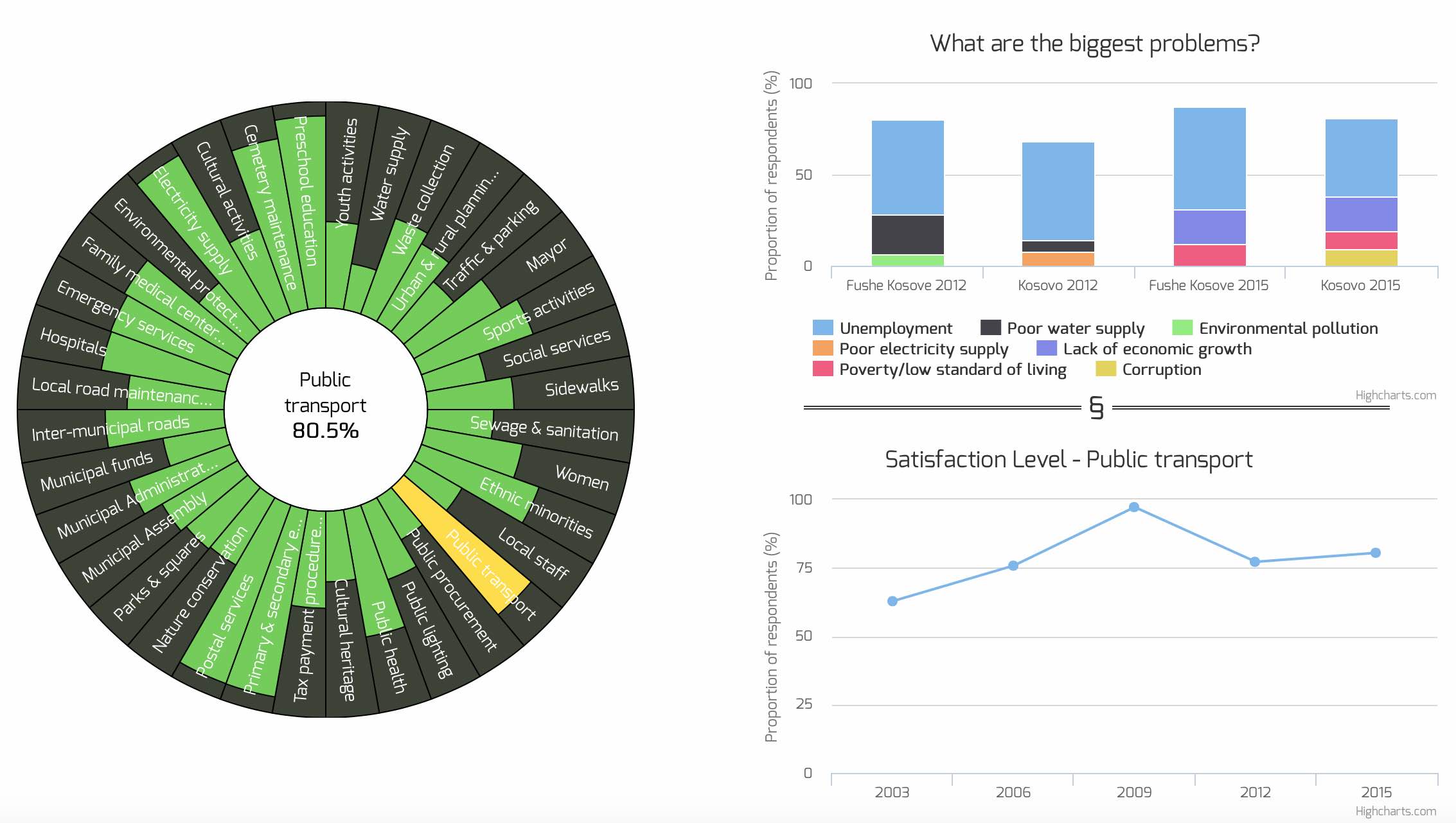
Last week, one of the cooler projects I have worked on since I started with Open Data Kosovo finally got released to the public. The project was to visualize data collected by a survey called Kosovo Mosaic. This survey is run every three years across all 38 municipalities in Kosovo and asks citizens, among other things, how satisfied they are with a range of services the municipality and government provides. 2015 was the fifth installment of the survey.
Our job[1] was to work with the Kosovo Mosaic data and come up with a way to visualize it so that people who are not into spreadsheets and coding can interact with it and get something from it. Our solution, using D3.js and Highcharts, was to provide users with a (hopefully) easy to understand interface to explore the data and find their own interesting conclusions.
Obviously the data presented in this visualization will appeal mostly to those who have some connection to Kosovo. However, even for those that do not, I thought you may be interested in seeing how we approached the problem and whether it works for you. If you do have any thoughts, things you like, things we could have done better, please feel free to leave a comment.
You can access the interactive visualization by clicking the picture below:

[1] Special thanks goes to Vullkan Halili who did most of the work on this project.
Leave a Reply