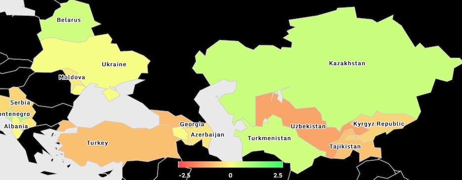
ECIS Development Tracker
17 December 2016
Interactive dashboard summarizing a range of governance and development indicators for countries across Eastern Europe and Central Asia from 1996 to 2015.

Kosovo Mosaic
1 August 2016
Visualization for interacting with data from the Kosovo Mosaic Survey, a survey in Kosovo that looks at the level of citizen satisfaction with a range of municipal and government services. Utilizes Highmaps, Highcharts, and D3.js.

Interactive Map of Cyclist Accidents in the ACT
29 December 2015
An interactive map of all traffic accidents in the ACT involving cyclists from 2012 to 2015. For a more detailed explanation, please read here. For the visualization, click the image below:

Zoomable Procurement Treemap
15 November 2015
Recently, as part of my work for Open Data Kosovo, I created a treemap that allows users to drill down into procurement data to see where procurements went over (redder shades) or under (greener shades) budget. It also allows you to drill down into the data any way you want, by municipality, by funding source and so on. However, for all these nice features, the part that I am proudest of is actually something that is not immediately obvious to the user – how the data is served to the visualization.
To develop a treemap that allows users to zoom in through different levels requires the JSON data to be nested in a particular way. By allowing the user to choose how to zoom in through the data, I have to dynamically generate a nested JSON file based on the user’s choices. That is exactly what is happening in the background through this simple app. From an underlying csv file, the app dynamically generates nested JSON based on the URL provided. The visualization simply generates a URL based on the choices and pulls the data from the app.
Anyway, feel free to leave a comment or email me if you would like any further details. Here is the visualization:

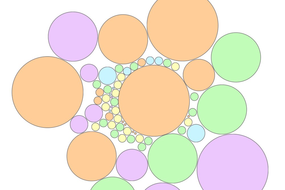
My Resume in a Bubble Chart
Sept 30 2015

